The Census Crunch took 18 hours to develop. And yet I’m not certain it could be declared to be ready. Here are some issues I can see with a quick glance:
- If the window width is small (e.g. on a smartphone), the navigation bar wraps—instead, the menu should change into a “hamburger” button.


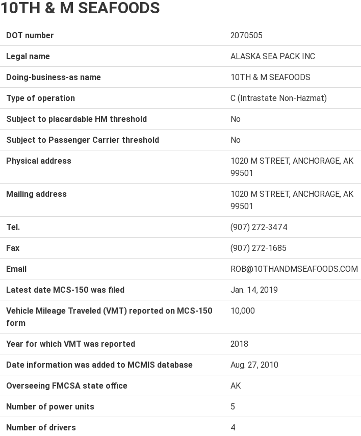
- The page with details about a business is a hard-to-read, boring list of attributes. It should really be formatted differently. This one alone is easily a few hours of work.

- The headings of the table use some strange arrows as sorting indicators. They should instead be small black triangles.

Verdict: It’s not decent. In fact, if you were a client and I delivered this to you, I’m confident you would identify more issues on which you’d like this to improve. And, by the way, if I gave you a better formatted details page, you would then tell me it still needs some improvements and it would need to go through a second round of changes.